

Dim3nsioneer 558
woop woop new look. Forum is pretty slow though
Well, keep the good things and replace the bad ones... 

woop woop new look. Forum is pretty slow though
Well, keep the good things and replace the bad ones...
Ok, a refreshed forum look...
BUT...the profile dropdown menu is always shown for me and blocks part of the page. There is nothing I can do to prevent it from showing...except logging out...but that kind of defeats the purpose :(

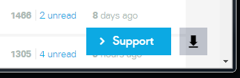
There is also this overlay at the lower right corner that is always there...
What was so wrong about having this in the top menu...together with the other menu options???
Just tried with IE (the other pics were from Chrome) and there I cannot even login 
(Maybe that is the case in Chrome also...will test that after I have posted this...)
First of all...where is the login link? I'm a registered user and thus "Sign up" is not what I want to do.

But lets disregard that for now and "sign up"...

Please tell me where I should fill in my login credentials
But wait...didn't I click on the "Sign up" button??? Why am I taken to a "Login" page and not to a page where I can register as a new user???
In Chrome it looks like this when you are not logged in:

And when you click on "Login" you are shown a tabbed form where you can either login or sign up. So the previous issue seems to be related only to IE.
Hi @Nilrog, thank you for your posts. I also use chrome and I have none of those issues. What kind of OS are you running?
The Login tab where you can sign up or login (in Chrome) sounds normal. Our apologies for the inconvenience.
There are a few bugs we are fixing this / next week:
- Show amount of notifications at bell
- Distinguish 'unread' from 'view last' in overview
- Sending DM to a user for the first time can trigger error message. A DM to a user you have messaged before is no problem.
- We'll look into the speed, shouldn't have been affected by these changes.
Hi @Nilrog, thank you for your posts. I also use chrome and I have none of those issues. What kind of OS are you running?
Chrome on Windows 7.
Here is another "not so nice" picture of the profile overlay issue

Liking the update so far!8)
Hi @Nilrog, thank you for your posts. I also use chrome and I have none of those issues. What kind of OS are you running?
Looks like it is tied to notifications. If I have an unread notification the profile dropdown is always shown and I cannot get it to go away.
But if I read all the notifications then the profile dropdown behaves as it should 
I like the cleaner look.
I'm not crazy about the reply box text being so bold/dark. I keep checking to make sure it isn't really in "Bold" mode!
I'm always wary of the "Support" blue box on the lower right....my brain wants to click it and thinks it is "Send"! Maybe that's just me.
I find the underscore on the top menu (under Forum now) a bit distracting. There's too many horizontal menus which robs me of reading space. Can that be a user option to hide? I keep thinking the underscore is the line that used to indicate last read post
The forum still loads very slowly for me too. At work, we're on a fiber link and it's no quicker than my home internet.
Good changes, overall
Edited by GuestHi Paul,
What menu do you want to be optional? The Dashboard / forum / 3D prints / etc?
Personally, I think (quick) navigating is very important and this menu allows you to quickly switch between pages. Do you ever use these pages or are you mostly solely hanging around on the forum anyway?
We'll keep the support / send comment in mind. Maybe a different color or shape could help. We can look into that.
Has the forum always been slow, or does it seem slower?
I believe we had some things prepared that potentially could make it faster again.
Thanks for your feedback!
I am all for quick navigating.
For me, and others can certainly chime in, I find the one that says "Dashboard, Forum, etc) to be too much. Perhaps there can be an option to hide that. It may be useful to some but the top menu (Ultimaker , Explore, Products, etc) has all of those same options. It's a little redundant. (I think the Ultimaker menus have too much in them, the full horizontal menu of items is a little overwhelming to my eyes)
Speed has always been slow, clicking along the various forum topics.
Just some feedback!
Hi @Nilrog, thank you for your posts. I also use chrome and I have none of those issues. What kind of OS are you running?
Same behavior on Safari 9 on OS X 10.11. Again, it goes away when I clear all notifications.
Btw, the new color scheme used here has made it a lot harder to read, unless you have perfect 20/20 vision.
Thin light blue, and light grey, text on white background is imo not so easy for the eye to read. It was better before but now...I have to put a strain on my eyes to read some of the text here.
Also the use of a very light grey area around a white area is also making the appearance harder to view.
You mean the information under your name? The rest of the text has only gained in contrast so I would be inclined to think that made it easier to read?
I haven't received any email notifications lately, I will go check my settings to see if anything changed....but I thought I would mention it.
I haven't received any email notifications lately, I will go check my settings to see if anything changed....but I thought I would mention it.
Thanks, I checked and neither have I. Looking into it! Thanks for notifying us.
You're welcome
I checked my settings, everything is OK there.
Seeing lots of double posts. Such as here
[media=21381][/media]
https://ultimaker.com/en/community/22396-cura-23-beta-awesomeness-and-some-issues?page=6#unread
Was also present here, is gone now:
https://ultimaker.com/en/community/23135-bought-my-ultimaker-at-a-wrong-time
Also this topic always takes me to the top rather than the unread post:
https://ultimaker.com/en/community/23123-made-by-the-new-ultimaker?page=1#unread
update: email should be fixed now
double post is also noted!
Redirecting of notification has been bugging us for a while, very difficult to solve. But this week we discovered a new trace, hopefully it will bring us closer to a fix!
Getting notifications! Thank you
 1
1
You mean the information under your name? The rest of the text has only gained in contrast so I would be inclined to think that made it easier to read?
No, the whole forum feels more "washed out" now compared to before.


MariMakes posted a topic in UltiMaker Cura,


ArunC posted a topic in UltiMaker 3D printers,


Recommended Posts
Top Posters In This Topic
297
137
93
92
Popular Days
Apr 30
43
May 8
33
Apr 23
33
May 9
32
Top Posters In This Topic
SandervG 297 posts
Titus 137 posts
ultiarjan 93 posts
LePaul 92 posts
Popular Days
Apr 30 2015
43 posts
May 8 2015
33 posts
Apr 23 2015
33 posts
May 9 2015
32 posts
Posted Images
Titus 170
woop woop new look. Forum is pretty slow though
Edited by GuestLink to post
Share on other sites